
Three different people gave me completely conflicting advice while I was standing in an empty room holding a dry paint roller. My mother-in-law called to insist I needed to find something she referred to as "stork blue" because it supposedly wards off bad sleep spirits, which sounds like something from a fantasy novel but I was too tired to argue. My older brother swore I should just paint the entire room blackout-curtain black so the baby would sleep until noon, a hilarious lie because my eleven-month-old treats the concept of morning as a very loose, highly negotiable suggestion. And the guy at the local Portland hardware store strongly recommended "Coastal Fog," which I can confidently confirm is just damp gray.
I just wanted that classic baby blue color. You know the one. The pale, soft shade that looks like a clear morning sky before the coffee kicks in and the chaos begins. But apparently, when you ask the universe for that specific hue, it hands you a chaotic spectrum of paint swatches that range from aggressive neon teal to depressing corporate navy. I remember standing in the aisle, frantically typing baby blu into my phone with one thumb while balancing a coffee, just trying to find some objective data.
If you're anything like me, you approach parenting like a series of complex IT troubleshooting tickets, meaning you can't just go to a store and vaguely ask for a color based on a feeling. You need the exact string of characters. You need the source code.
Debugging the hex values of a nursery wall
Let's talk raw data for a second, because my brain needs quantifiable metrics to process the overwhelming reality of parenthood. When graphic designers and textile manufacturers talk about this specific shade, they aren't just winging it with a bucket of white paint and a few drops of dye. There's a documented, universally recognized digital benchmark for this color.
After falling down a massive late-night internet rabbit hole while my son used my chest as a mattress, I finally found the actual baseline firmware for the color. If you want to replicate it perfectly across your wall paint, custom prints, or nursery furniture, here are the hard specs you need to feed into the system:
- The Standard Hex Code: #89CFF0
- The RGB Values: 137 Red, 207 Green, 240 Blue
- The CMYK Translation: 43% Cyan, 14% Magenta, 0% Yellow, 6% Black (critical if you're printing your own wall art so it doesn't come out looking like a bruised plum)
There are slight variations, of course. My wife, who has a much better eye for design than my engineer brain, pointed out that some modern spaces use a Pantone-matched variation that leans a tiny bit warmer. But #89CFF0 is the undeniable anchor point. Knowing these numbers meant I could finally stop arguing with the hardware store guy about what constitutes a cloud and just hand him a formula.

Why my doctor subtly pushed us toward cool tones
I initially thought the color of the room was just a purely aesthetic choice to make the house look nice for the grandparents' photos. But during our four-month checkup, my doctor—who has the patience of an absolute saint when I show up with meticulously tracked Excel spreadsheets of my son's sleep intervals—casually mentioned that sleep environments should physically and visually cool the baby down.

Apparently, looking at the right shade of light blue tricks the human nervous system into lowering its heart rate. It simulates the serenity of shallow water and clear skies, which I guess is hardwired into our evolutionary code. I started tracking my own vitals with my smartwatch while sitting in the painted nursery, and I'll be damned if my resting heart rate didn't actually drop a few beats per minute just staring at the wall.
The medical consensus seems to be that newborns are terrifyingly easy to overstimulate. High-contrast, highly saturated colors like bright reds or neon greens act like a visual alarm bell, triggering their brains to stay alert and look for danger. The low saturation and high lightness of a proper baby blue prevents visual fatigue, helping transition their little processing units into a state of rest. It makes sense why maternity wards and pediatric hospitals are basically drowned in this color.
The great mid-century marketing conspiracy I can't stop thinking about
Here's where I get slightly unhinged about historical data. Before the 1920s, practically all infants, regardless of sex, predominantly wore white. White cotton was the standard because it was incredibly practical—you could just boil it, bleach it, and sanitize whatever ungodly mess the baby had produced that day. Nobody looked at a newborn and thought their gender identity hinged on the pigmentation of their socks.
Then, somewhere in the 1940s and 50s, a bunch of department store marketing executives sat in a room and arbitrarily solidified the "blue for boys" and "pink for girls" dichotomy simply to sell more distinct clothing lines to parents who previously just handed down the same white gowns to every kid. It was an entirely manufactured consumerist matrix designed to double retail sales, and society just blindly accepted it as a law of nature.
Today, thankfully, modern parents are reclaiming these pale hues as gender-neutral, nature-inspired tones meant for any child who enjoys the concept of a sky. Honestly, anyone still doing those explosive gender reveal parties with colored smoke bombs in the woods needs their Wi-Fi disconnected immediately.
Troubleshooting the 60-30-10 design rule without losing your mind
When it came time to actually apply this color to our physical space, I almost ruined it by trying to pair it with stark, hospital-grade white furniture. My wife intervened, gently reminding me that we were raising a human child, not operating a sterile semiconductor cleanroom.

She introduced me to the 60-30-10 rule, which is apparently a foundational law of interior design that I had managed to avoid for thirty-something years. You basically just have to give up on clinical whites and embrace a strict ratio to make the room feel cohesive without turning it into a monochromatic smurf village.
- The 60% Base: This is your dominant color. For us, it was painting three of the nursery walls in that exact #89CFF0 shade.
- The 30% Foundation: Warm, earthy neutrals to ground the room. Think unbleached organic cotton, natural birch wood cribs, and soft cream rugs. This prevents the room from feeling like a freezer.
- The 10% Accent: Tiny pops of contrasting warmth, like a soft lemon yellow lamp or a sage green throw pillow.
If you're currently staring at paint samples and feeling the familiar creep of decision fatigue, taking a break to look at our organic nursery collection might actually give you a better sense of how these colors work together in real fabrics.
Field testing gear that really matches the room
Building the room is one thing, but populating it with gear that survives contact with the enemy (the baby) is an entirely different challenge. I've become intensely picky about what we bring into the house, mostly because I'm the one who has to clean it at two in the morning.
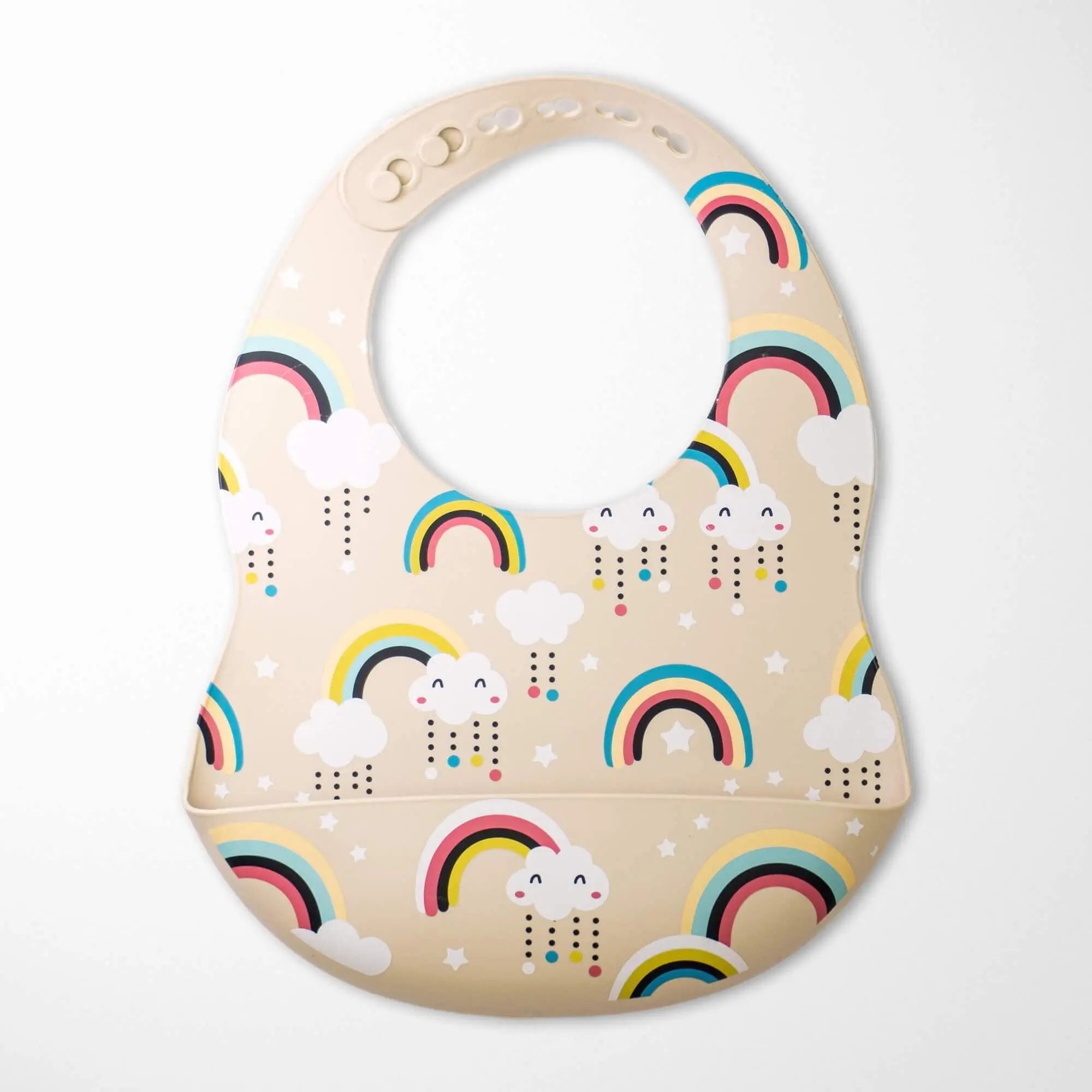
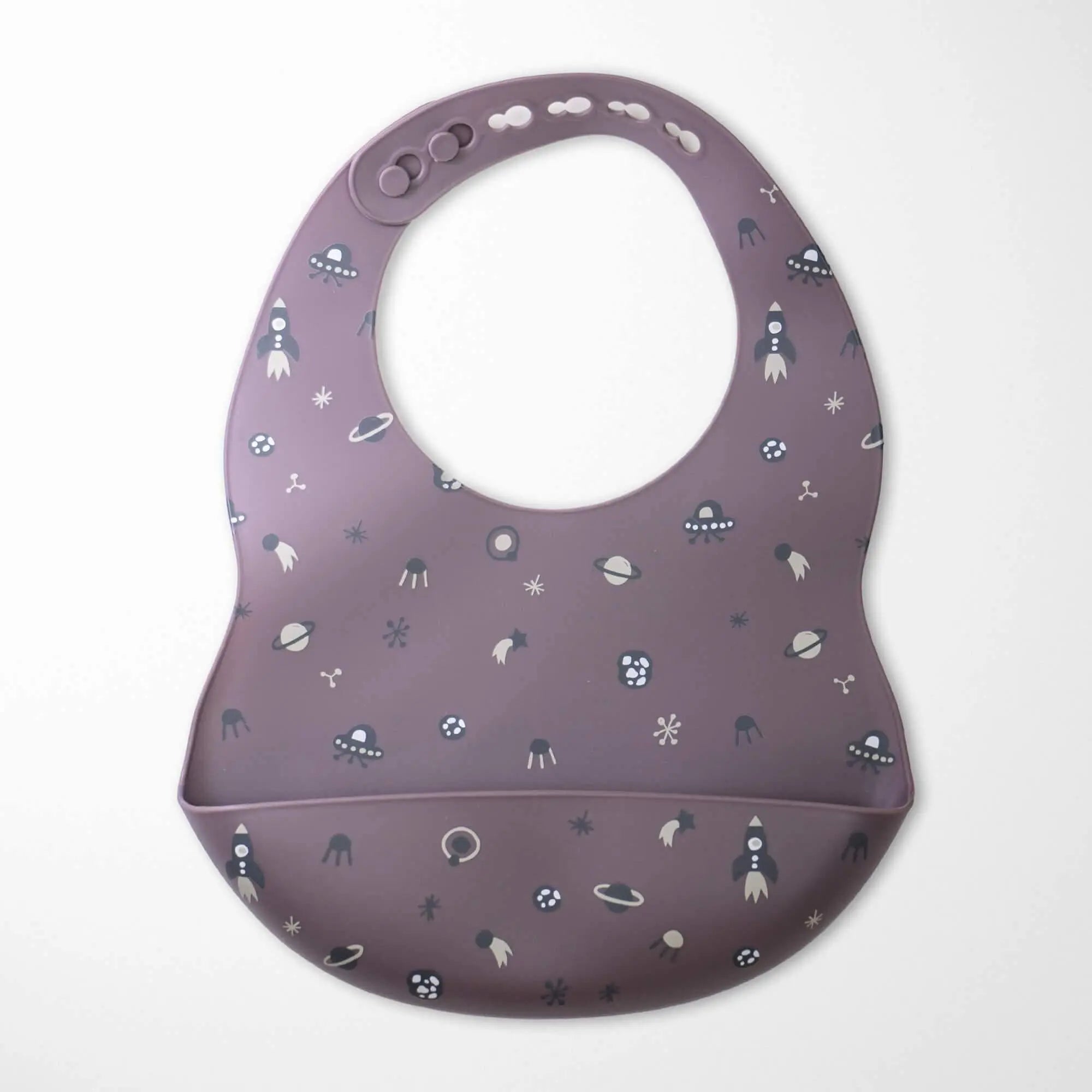
My absolute favorite piece of functional gear in this color palette is the Blue Fox in Forest Bamboo Baby Blanket. The Scandinavian-inspired blue fox and leaf pattern perfectly hits that pale, calming tone without being aggressively cartoonish. But the real magic is the material. Bamboo fabric's thermoregulation is basically an active cooling fan for your baby's sleep cycle. We had an incident last month involving a spectacular amount of spit-up at 3 AM. After running it through the wash, the blanket somehow came out even softer, and the natural blue dyes didn't fade a bit. It's a workhorse masquerading as a luxury item.
Then there's the Bear Teething Rattle Wooden Ring Sensory Toy. Look, I'll be completely honest about this one. It's a beautifully crafted object. The crochet cotton is soft, the untreated beechwood ring feels incredibly sturdy, and the light blue bear face matches our walls flawlessly. It looks fantastic sitting on the shelf. But my son currently prefers to aggressively gnaw on the rubber feet of my ergonomic keyboard or the dog's water bowl. That's just the reality of the user experience at eleven months. However, when I do manage to intercept him and swap the keyboard for the bear, the combination of the hard wood and soft crochet really does keep him occupied for a solid twenty minutes while I frantically answer work emails.
If you want to lean fully into the woodland aesthetic while keeping the eco-friendly materials, the Colorful Hedgehog Bamboo Baby Blanket is another brilliant piece of engineering. I spent an unreasonable amount of time reading about how Kianao achieves these specific blue and green hues without using harsh synthetic chemicals. Sustainable bamboo cultivation already uses significantly less water than conventional cotton, and their natural dye process means I don't have to panic when my baby inevitably tries to eat the corners of the blanket.
It's fascinating how a single string of hex code can dictate so much of your physical environment, from the walls to the textiles. Before we get to the messy, frantic questions you're probably searching for right now, take a minute to explore our organic teething collection to find gear that genuinely aligns with your newly established color data.
Some slightly chaotic questions I googled at 3 AM
Does a blue room seriously make the baby sleep longer?
I wish I could tell you that painting a room #89CFF0 is a magic firmware patch for sleep regression. It isn't. Your baby will still wake up because they lost their pacifier or just felt like yelling at the moon. However, the cool tones definitely reduce environmental overstimulation, which makes the process of getting them to wind down slightly less agonizing. It sets the stage, but you still have to put on the play.
How do I stop the blue walls from making the room look freezing cold?
This was my biggest mistake initially. If you pair pale blue with stark white LED bulbs and white furniture, your nursery will look like a meat locker. You have to aggressively introduce warm textures. Use soft amber lighting (around 2700K on the lightbulb scale), natural wood tones, and unbleached cottons to trick the eye into feeling warmth.
Are synthetic blue dyes in baby blankets dangerous?
Apparently, conventional cheap textile dyes can contain heavy metals and formaldehyde, which is terrifying considering babies experience the world by putting literally everything in their mouths. This is why I get so nerdy about brands that use plant-based or non-toxic dyes on organic fibers. If they're chewing on it, you want the chemical profile to be as boring as possible.
Is baby blue still considered just a "boy color"?
Only if you strictly adhere to the marketing guidelines of a 1950s department store catalog. We live in an era where water and sky belong to everyone. The color is about biological calming mechanisms and nature-inspired aesthetics, not assigning a gender role to an infant who currently thinks a cardboard box is a five-star meal.


Share:
The Truth About That Heirloom Crochet Baby Blanket
Why Watching Baby Boom As A Parent Feels Like A Personal Attack