
I was standing in the middle of the paint aisle at a home improvement store, thirty-eight weeks pregnant and sweating through my maternity leggings. I held forty-two different swatch cards that all claimed to be the definitive pastel blush. My husband was looking at his watch. I was about to cry over a shade called whisper dusk. The biggest lie we're sold as modern parents is not that we'll eventually sleep again. It's the idea that this specific pale rose color was somehow biologically pre-ordained for infant girls.
You type 'baby p' into your search bar at two in the morning, and the algorithm immediately floods your screen with aggressively gendered aesthetics. We just accept it. We buy the clothes, paint the walls, and stock the dressers without ever wondering why we do it.
The great gender marketing scam
People think this color assignment is an ancient, inherent part of human biology. That's total garbage. If you look at clothing catalogs from 1918, trade publications literally instructed mothers to dress their boys in pink. The logic back then was that red was a fierce, strong, masculine color. Pale rose was just a watered-down version of red, therefore perfect for little boys to grow into their masculinity.
Blue, on the other hand, was considered delicate and dainty, making it the obvious choice for girls. I think about this every time an older relative insists my daughter needs more bows to look feminine. We swallowed a massive marketing pill sometime in the 1950s. Mamie Eisenhower wore a very specific pastel gown to the presidential inauguration, department stores realized they could sell twice as many clothes if they hyper-gendered everything, and suddenly the script flipped entirely.
I find it hilarious that we base our entire nursery design philosophy on mid-century retail capitalism. But here we're, arguing with our mothers-in-law about paint tones that look like melted strawberry ice cream.
Light blue is fine if you like looking at a clear sky, but whatever.
How pixels lie to tired parents
Graphic designers and web developers will tell you that the universally recognized digital baby pink hex is technically #F4C2C2. It has an RGB value of 244 red, 194 green, and 194 blue. That looks great on a glowing screen when you're browsing a minimalist lifestyle blog.
But when you try to translate that exact digital hue to physical fabric or wall paint, things get weird fast. You think you're buying a soft, earthy tone, but the crib sheets arrive looking like neon bubblegum. It feels as outdated as using a rusted baby pin on a vintage cloth diaper. You realize quickly that screens are backlit, and your dimly lit nursery is not.
And that's why shopping for sustainable textiles is so frustrating. A true, calming baby pink should look slightly dusty. It should look like it came from the earth, not a chemical factory. When it's too saturated, it completely ruins the calm vibe you're desperately trying to curate.
Sensory overload from the triage desk
Listen, I've seen a thousand overstimulated infants in the pediatric ER. Parents bring them in at midnight, panicked because the kid has been screaming for four hours straight. We check their vitals, rule out fevers, check for hair tourniquets on their toes, and half the time, the kid is just profoundly exhausted. Their nervous system is fried.

My doctor, Dr. Gupta, told me once that environmental contrast matters more for brain development than the actual colors you choose. But she also hinted that highly saturated, aggressive colors might keep a tired infant on edge. I'm not entirely convinced a wall color can cure colic. Still, there's a certain logic to not surrounding a newborn with visual noise.
Color psychology suggests that muted, desaturated pastels lower heart rates. Honestly, they probably just look less offensive to us when we're functioning on two hours of unbroken sleep. A soft, dusty rose doesn't yell at you when you stumble into the room for a 3 AM feed.
Throw out your neon swatches and just buy a neutral crib while you learn to live with whatever pastel mess your relatives gift you.
The gear that actually survives my house
Because I'm deeply skeptical of the baby industrial complex, I'm very picky about what actually makes it into my daughter's room. The color has to be right, but the material matters more. Here's what I actually use, and what I tolerate.
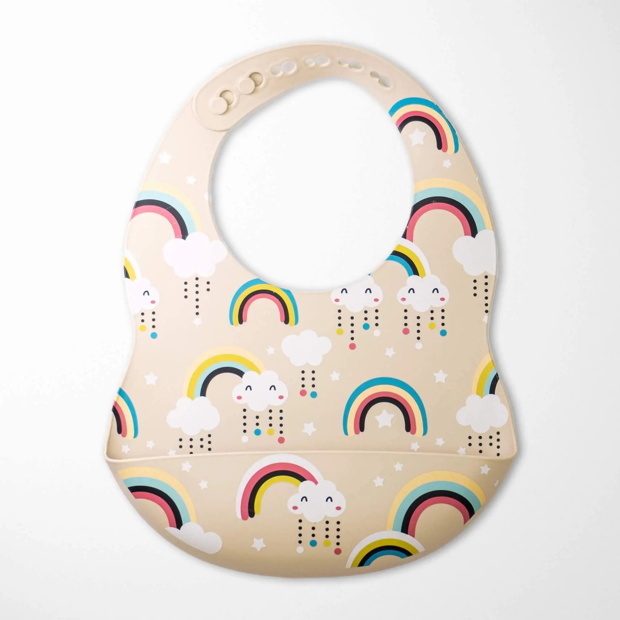
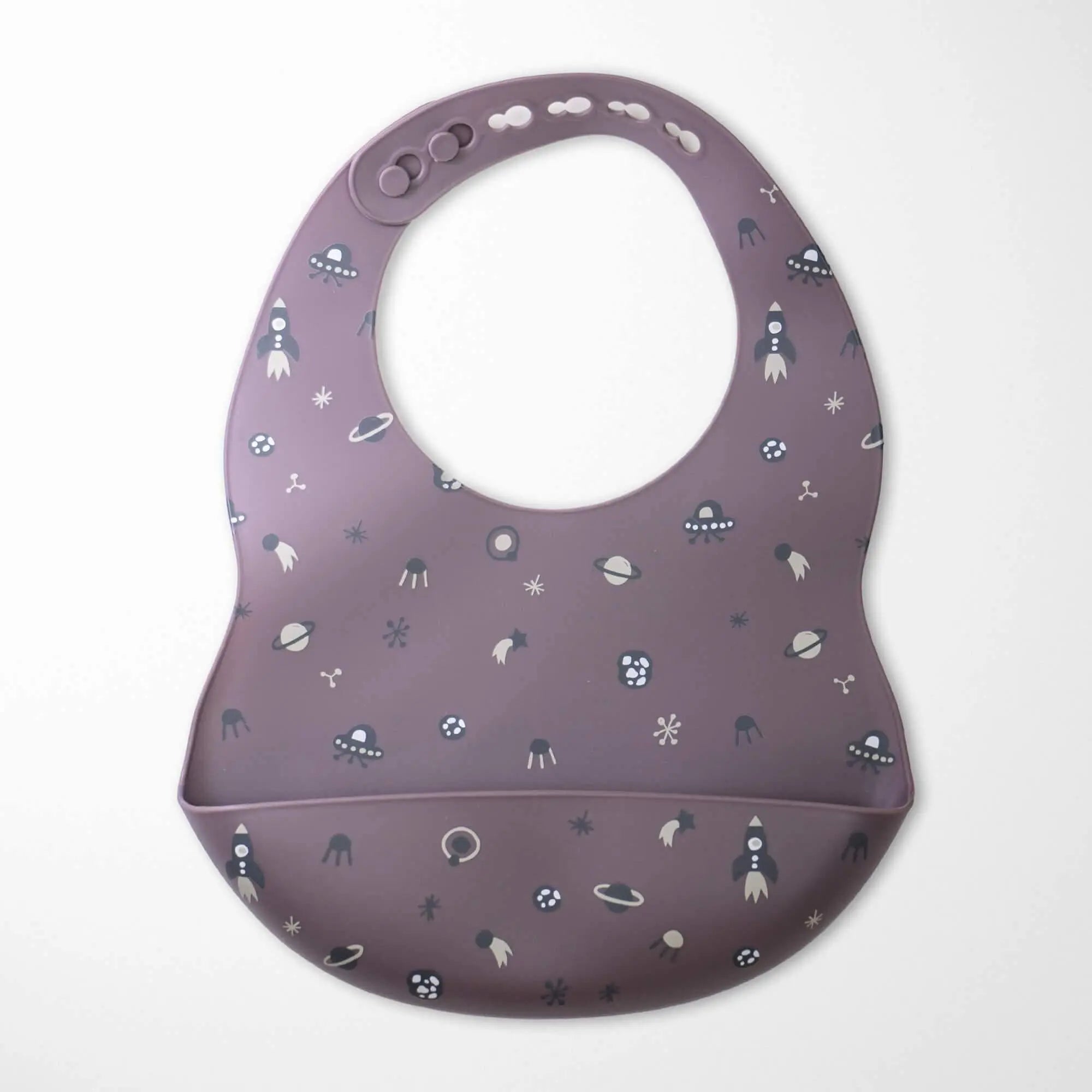
My absolute favorite thing right now is the Organic Cotton Baby Blanket in the Goose Pattern. When my kid had terrible newborn acne, I was terrified of synthetic fabrics touching her face. This blanket is double-layered organic cotton. It breathes. But the best part is the color. It's a very muted, earthy pink. The geese are weirdly charming. She drags the larger size around the living room now, and despite being washed roughly forty times in my terrible washing machine, it hasn't lost its softness.
On the other hand, we've the Deer Teething Rattle Wooden Ring. I'll be completely honest about this one. From a safety perspective, it's great. The untreated beechwood ring is solid. I don't worry about her choking on it. But the crochet deer head gets soggy with drool almost immediately. The little pink bib on it's adorable for photos, but if you've a heavy drooler, you'll be hand-washing this thing constantly. It's cute, but it requires maintenance.
If you want something to break up the pink monotony, I highly think the Pink Cactus Organic Cotton Baby Blanket. My doctor said visual contrast helps their eye tracking, or something vaguely scientific like that. The blue and green cacti against the pale background give them something to honestly focus on. It's lightweight, GOTS certified, and it just feels nice to the touch.
Browse the organic blanket collection if you're tired of scratchy synthetic fabrics.
The avocado pit conspiracy
If you really want to know where the best, softest version of this color comes from, you've to look at natural dyes. I went down a rabbit hole late one night and learned that sustainable brands often achieve that perfect, dusty blush tone using avocado pits and skins.

It sounds like a fake internet hack, but the tannins in avocado pits naturally yield a stunning, soft rose color without any toxic chemicals. I tried boiling them in my kitchen once to dye some old muslin burp cloths. My kitchen smelled terrible, I ruined a perfectly good stainless steel pot, and the dye job came out looking like a patchy sunburn.
I quickly realized it's much easier to just buy ethically made textiles from brands that know how to handle natural dyes properly. But knowing the color comes from a plant rather than a petroleum byproduct makes me feel slightly better about my parenting choices.
When you buy organic cotton that uses natural or low-impact dyes, the color naturally fades a tiny bit over time. I really prefer this. It gives the fabric a lived-in, heirloom quality. It stops looking like a prop for a social media post and starts looking like a real thing a child sleeps with.
You can verify a brand's sustainability claims by looking for GOTS certification, which guarantees they aren't dumping harsh heavy metal dyes into the local water supply just to get a brighter shade of magenta.
Check out the organic nursery accessories before you settle for big-box store synthetics.
Things you probably want to know
Does the shade of pink really affect infant sleep?
Dr. Gupta claims room temperature and a decent swaddle matter a hundred times more than your paint color. That said, heavily saturated neon colors reflect more light. If you've streetlights outside the nursery window, a bright pink wall is going to bounce that light around the room. Stick to dusty, muted tones if you want them to sleep, but honestly, if a kid is going to wake up at 4 AM, they'll do it regardless of your interior design choices.
Are natural dyes safe for babies who chew on everything?
Yeah, and that's exactly why I care about this. My daughter puts every single fabric she touches directly into her mouth. Conventional dyes often contain heavy metals and formaldehyde resins to make the color stick to synthetic fibers. Natural dyes, like the ones used on high-quality organic cotton, don't use those binding agents. They're infinitely safer when your kid inevitably decides their blanket is a snack.
Why do my pastel fabrics look dingy after a few months?
Because you're probably washing them in hot water with aggressive synthetic detergents. Beta, stop boiling your laundry. Natural fabrics and low-impact dyes need cold water and gentle soap. They might lose a tiny bit of vibrancy, but they shouldn't look gray. If they look gray, your washer is probably depositing residue from your own clothes onto the baby stuff. Wash them separately.
Can I mix baby pink with other colors without it looking chaotic?
I hope so, because matching everything perfectly is a symptom of losing your mind. The trick is to treat the pale blush color as a neutral. Pair it with sage green, warm mustard yellow, or natural wood tones. If you try to match the exact same shade of pink across rugs, curtains, and crib sheets, the room will look like a sensory deprivation tank. Let it clash a little. It looks more human that way.
Is it weird to use pink for a boy's nursery?
Only if you care about the opinions of people who haven't updated their worldview since 1954. Yaar, it's literally just a reflection of light hitting your retinas. Put your son in whatever color you want. He will spit up on it just the same.


Share:
The Absolute Mess of Dressing an Infant in a Baby Pink Dress
Decoding Your Infant's Pink Fingernails (And Surviving Trim Time)