I'm standing in the paint aisle of B&Q at 8:15 on a Tuesday, trying to wipe half-digested porridge off my trousers, when the teenager behind the mixing counter asks me which specific shade of pale pink I want. I look at him, completely dead inside. I've exactly four minutes before my twin daughters, Maddie and Bea, realise we've stopped moving. Maddie is already trying to lick a display roller, and Bea is softly weeping because her left sock is, quote, "too round."
What you should never, under any circumstances, do is attempt to choose a nursery palette by squinting at a 2x2 inch cardboard swatch under aggressive fluorescent hardware store lighting while operating on three hours of broken sleep. You will inevitably buy a tin of gloss that looks like a tragic 1980s bubblegum disaster on the wall, forcing you to repaint the entire room at midnight while questioning every life choice that led you to this moment.
What finally worked was abandoning the hardware store entirely, buckling the children into their car seats, bribing them with organic rice cakes, and doing what any former journalist with entirely too much anxiety does: obsessively researching the actual digital codes for pastel pink so I could just order the correct things online without speaking to another human being.
The hardware store breakdown and the actual hex codes
It turns out that what society calls "baby pink" isn't just a vague concept you gesture at wildly—it's a heavily policed set of design mathematics. If you're trying to match nursery curtains to a cot sheet, or desperately trying to coordinate a first birthday party without the decorations clashing horribly, you actually need to know the numbers.
Here's what I learned while ignoring my mounting pile of unwashed nappies:
- The definitive digital hex code: #F4C2C2. This is the gold standard. It's soft, slightly warm, and doesn't scream at your retinas when you turn the dimmer switch on at 3am.
- The cooler alternative: #FFB7CE. This one is a bit sharper, like candy floss that's been left out in the snow.
- The print nightmare (CMYK): If you're ordering custom prints or physical items, digital codes mean absolutely nothing. You need ink values, which for this specific shade are roughly 0% Cyan, 20% Magenta, 20% Yellow, and 4% Black.
I learned that last bit the hard way after ordering custom wall art for the girls' room. I gave the print shop a random digital code, and the canvases arrived looking like heavily processed salmon. I spent two days frantically googling the exact American spelling of the baby pink color just to find the right conversion charts, falling asleep at my laptop and waking up with the keyboard imprinted on my forehead and a search history that just read baby p.
When pink was for fierce little boys (a historical betrayal)
The deepest irony of my standing in a shop agonising over whether a pastel pink was "too girly" for our modern, progressive household is that for centuries, pink was basically considered the visual equivalent of a protein shake for toddlers.

I fell down a massive historical rabbit hole reading design historian Regina Lee Blaszczyk's work while pinning a squirming Bea to the changing mat (and accidentally stabbing myself with a literal baby pin in the process). In the 19th century, pink was fiercely defended as a masculine colour. Because red was the colour of blood, war, and the military, pink was seen as its younger, slightly less aggressive brother. It was a strong, decided colour. Light blue, meanwhile, was considered delicate, dainty, and deeply feminine, which is why they wrapped infant girls in it.
I spent three whole days furious about this. I could have dressed the twins in dark, stain-hiding navy and claimed I was just being historically accurate! Think of the laundry I could have saved. I pictured myself at the playground, aggressively informing the other parents that actually, Maddie's muddy pink dungarees are a tribute to 19th-century warrior toddlers. It would have been magnificent. The sheer durability of the historical precedent is staggering, especially when you realise how much money the baby industry makes by convincing us that gender is inherently tied to pastels.
Then the 1950s happened, Mamie Eisenhower wore a pink dress to an inauguration, Brooks Brothers ran a marketing campaign, and suddenly the entire western world collectively agreed that girls must look like spun sugar.
What our GP vaguely muttered about infant vision
Before you spend a small fortune painting four walls in #F4C2C2, you should probably know that your newborn is entirely oblivious to your interior design efforts.
During our six-week checkup, I proudly mentioned to Dr. Patel that we had finally finished the nursery in a calming, anxiety-reducing pastel. I expected a medal, or at least a firm handshake. Instead, he looked at me with the deep, deep pity usually reserved for people who try to bring un-collapsed prams onto the Central line during rush hour.
According to our GP, newborns are basically blind to light colours. Something about their rods and cones and their retinas being entirely undercooked at birth means they can only really process high-contrast black, white, and grey. He vaguely gestured at a medical chart and mumbled that pastel colours don't even begin to register in their brains until they're about three to five months old.
So, for the first few months of their lives, I had basically put Maddie and Bea in a room that looked to them like a blurry bowl of porridge. The calming psychological benefits of the baby pink colour only kick in later, when their visual cortex finally figures out how to decode the visible spectrum (which, coincidentally, is right around the time they learn how to aggressively projectile vomit onto your freshly painted skirting boards).
The great contrast ratio disaster of 2022
There's a massive practical difference between how a colour looks on Pinterest and how it functions when you're severely dehydrated and operating on survival instincts.

In a fit of aesthetic enthusiasm, I bought white nursing chairs, white changing mats, and white storage baskets to go against the pale pink walls. I thought I was creating a serene, cloud-like oasis. What I actually created was a visually inaccessible nightmare.
If you care about digital accessibility standards (and as a former journalist, I pretend to), the contrast ratio between pastel pink and white is about 1.6:1. This is mathematically terrible. In practical terms, it means when you walk into the nursery at 4am to find the Calpol, everything blends into one glowing, amorphous blob. I spent twenty minutes patting the walls like a blindfolded hostage trying to locate the light switch.
If you're going to use this colour, you must anchor it with something dark. Throw a charcoal rug on the floor. Buy navy blackout curtains. Do whatever it takes to give your sleep-deprived eyes a fighting chance of depth perception, otherwise you'll end up tripping over a wooden block and quietly weeping into a pile of muslins.
Chemical paranoia and the quest for organic dyes
My final descent into madness involved the actual chemical composition of the things I was putting near my children's aggressively sensitive skin.
Standard paints and cheap clothing dyes are heavily reliant on volatile organic compounds (VOCs) and harsh chemicals. I learned this after opening a cheap tin of paint that smelled so strongly of industrial solvents it made my back teeth ache. I immediately dragged the twins out of the house, convinced I had permanently damaged their lung capacity, and spent the afternoon frantically reading about off-gassing and contact dermatitis.
This is where my obsession with organic textiles began. If you're going to wrap your child in pastels, it's worth caring about how that colour was achieved.
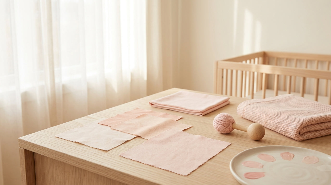
My absolute salvation in this department has been Kianao's Organic Cotton Baby Blanket Soft Double-Layer Goose Pattern. Maddie threw up on our only good hospital blanket, and I ordered this one out of pure desperation. It's brilliant. The geese look mildly judgemental, which suits my parenting style, but more importantly, it's huge (get the 120x120cm size, trust me), incredibly soft, and uses GOTS-certified organic cotton with safe dyes. It seriously manages to hide minor stains beautifully despite the pale pink background, and I don't panic when Bea inevitably tries to chew on the corners.
On the flip side, we also bought the Deer Teething Rattle Wooden Ring Sensory Toy. Look, it's fine. It's completely safe, the untreated beechwood is solid, and the little crochet pink bib matches the room perfectly. But Bea just stares at the deer's antlers in confused silence for about forty seconds before violently throwing it under the sofa. It's aesthetically pleasing, but as a teething tool, my children much prefer gnawing on my actual knuckles.
If you need a backup blanket while the goose one is in the washing machine (which will be always), their Bamboo Baby Blanket Swan Pattern is also excellent, mainly because bamboo controls temperature so well that the girls don't wake up sweating like they just ran a marathon.
If you're also spiralling about toxic dyes, skin reactions, and trying to make your nursery look somewhat intentional instead of like a bomb went off in a Mothercare, you might want to look at Kianao's full collection of organic baby essentials.
To avoid spending your weekends arguing with paint mixing machines, crying over CMYK values, and accidentally poisoning your children with cheap wall gloss, just stick to organic fabrics and accept that your children will inevitably ruin everything beautiful you buy them. It's quite liberating, really.
Ready to stop panicking about toxic dyes and just buy something nice? Add one of our breathable organic blankets to your cart and give your baby the safe, chemical-free comfort they seriously deserve. Shop Kianao's sustainable collection now.
Questions I desperately googled at 3am
Why does my nursery paint look completely purple at night?
Because you didn't check the light reflectance value, did you? Pale pinks with a blue undertone (like our friend #FFB7CE) will pull heavily violet under artificial warm LED bulbs. Always test the swatch in the room at night, not just in the blinding midday sun.
Can newborns honestly tell if I messed up the colour scheme?
Absolutely not. For the first few months, they've the visual acuity of a bat flying through thick fog. They literally can't see pastels. You could paint the room neon orange and they wouldn't care, though your own retinas might slowly detach.
Is organic dye really that different for a baby pink blanket?
Yes. Conventional pink dyes often use azo compounds, which can break down into harsh chemicals that irritate a baby's paper-thin skin. GOTS-certified organic dyes skip the toxic heavy metals, which is why I don't have a panic attack when Maddie spends twenty minutes sucking on her blanket.
What do I do when my partner hates pastel pink?
Compromise by using it as an accent colour rather than painting the whole room like an explosion in a candy factory. Pair a pink organic cotton blanket or a single piece of wall art with sage green, dark charcoal, or warm oatmeal. It looks incredibly modern and stops your partner from complaining about living in a dollhouse.
How do you match clothes to a specific digital colour code without losing your mind?
You don't. You accept that "pink" in the textile world ranges from "faintly bruised peach" to "aggressive fuchsia." Buy clothes because they're soft, organic, and have poppers in logical places, not because they perfectly match a hex code you found on a design blog.


Share:
The Truth About Those Perfect Baby Playing Quotes I Used To Hate
Why I Finally Stopped Fighting the Whole Pastel Baby Pink Phase